Overview
Problem
SPOT App, a freelance/gig-centric app, provides jobs to people who have struggled
to find work due to lack of professional experience and skills. The COVID-19
pandemic made it more difficult to find work as unemployment increased across the
globe.
They had been receiving feedback from workers who said they weren’t prepared for
the jobs. Employers said that workers didn’t know protocol and areas of the job
when initially hired.
Role
UX/UI Designer, Researcher, Information Architect
Timeline
Nov. 2020 - Dec. 2020
Tools
Figma, pen & paper
Solution
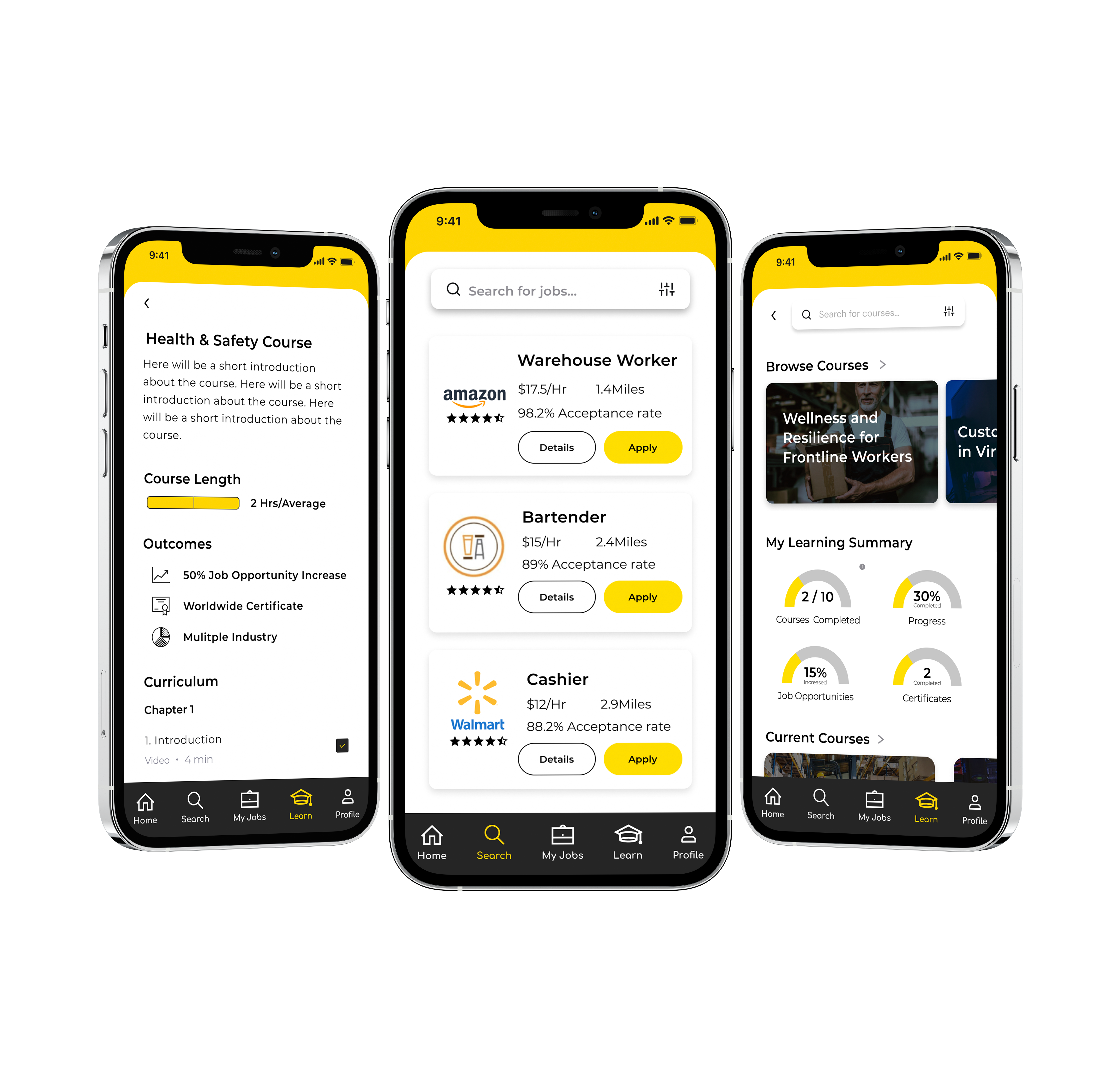
SPOT App was interested in integrating a Learning Management System (LMS) that would allow employees to better prepare for their upcoming jobs. The LMS would allow employees to learn as they earn. Employers could track employees’ progress through the course to ensure the employee was learning the job properly.
Approach
01. Research
- Competitive Analysis
02. Design
- Sketches
- Wireframes
- Prototype
03. Evaluate
- Usability Testing
Research
Competitive Analysis
From the initial discussion with SPOT App, they wanted a competitive analysis
completed to determine how similar platforms helped gig workers learn.
We identified six competitors in total whose platforms focused on: a) connecting
gig workers with jobs, b) providing an LMS users can use as a training apparatus,
and c) operating in the Canadian market. We used the Nielsen Norman Group’s
Usability Heuristics as a guiding criterion.
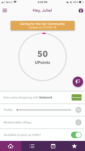
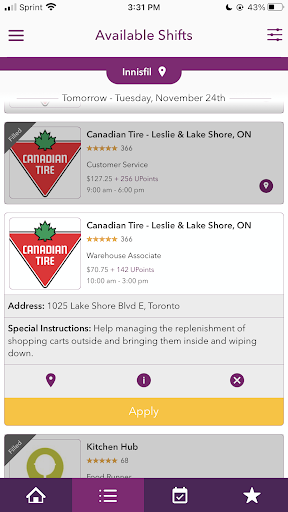
- Hyr connects businesses and workers to fill any shift, at the best possible price.
- Aesthetic and Minimalist Design
- Onboarding Experience is simple. However, not enough contrast and blank space caused a distraction and readability issues.
- Profile photos. Not sure why users need many photos here. Is that necessary?
- Visibility of System Status
- The home tab is slightly overwhelming to the eye and uses phrases that aren't quite obvious to the user such as 50Upoints.
- The 'Shift Summary' is a great way to provide essential details about the job and reviews.
- Shifts Status is another subtle but valuable feature that uses different colors to show the shift status. Grey - Unavailable, Yellow - Applied-to Shifts.
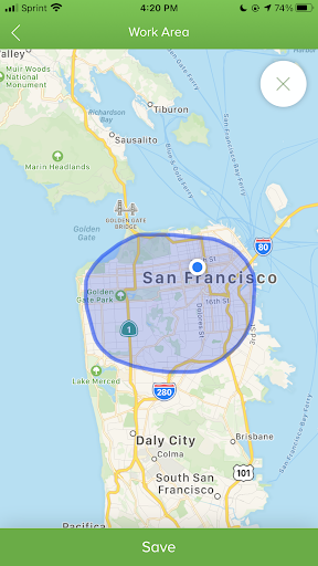
- Tasker matches up gig workers with furniture assembly, moving, and other maintenance services.
- User Control and Freedom
- Users can draw on a map to choose a work area that’s suitable for them. This allows total control instead of just entering a zip code.
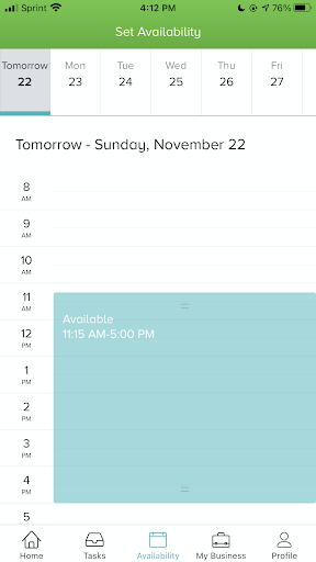
- Users can sync their calendar to better manage their time, by simply tapping and dragging the blue bar to add time slots.
- Freelancer is the world's largest freelancing and crowdsourcing marketplace.
- Aesthetic and Minimalist Design
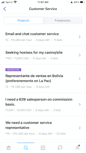
- Bullet point summary to help users get a quick view about the job, time, biding and pay.
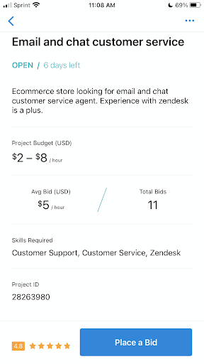
- On the job page. Summarized job details, avg bid/total bids, skill requirements and employer rating.
- Canvas LMS is a cloud-based learning management system (LMS) specifically designed for K-5 on up through higher education institutions.
- Aesthetic and minimalist design
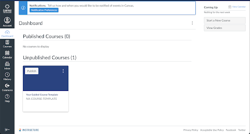
- The website and app has a clean, minimal design that allows the user to digest information easily without being overwhelmed.
- A dashboard and menu with essential items allows the user to access important information quickly.
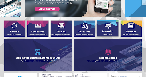
- Absorb LMS is a cloud-based learning management system that empowers companies around the world to deliver training to employees efficiently.
- Flexibility and Efficiency of Use
- The interface is big and bold, making the dashboard easily legible. The dashboard also gives access to important features the user will need more often.
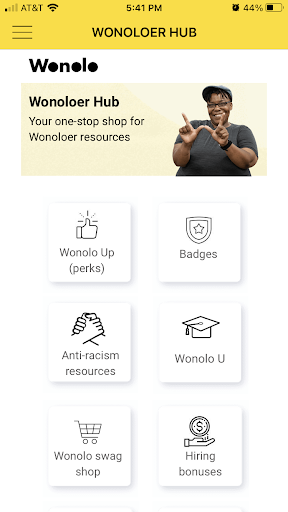
- Wonolo connects people with immediate daily shifts and temp-to-perm opportunities around their location.
- Recognition Rather Than Recall
- Like Absorb LMS, Wonolo contains a resource center where a user can learn about the latest policies, earn badges, and more to enhance their Wonolo working experience.
Hyr
Tasker by Taskrabbit
Freelancer
Canvas LMS
Absorb LMS
Wonolo
Journey Map
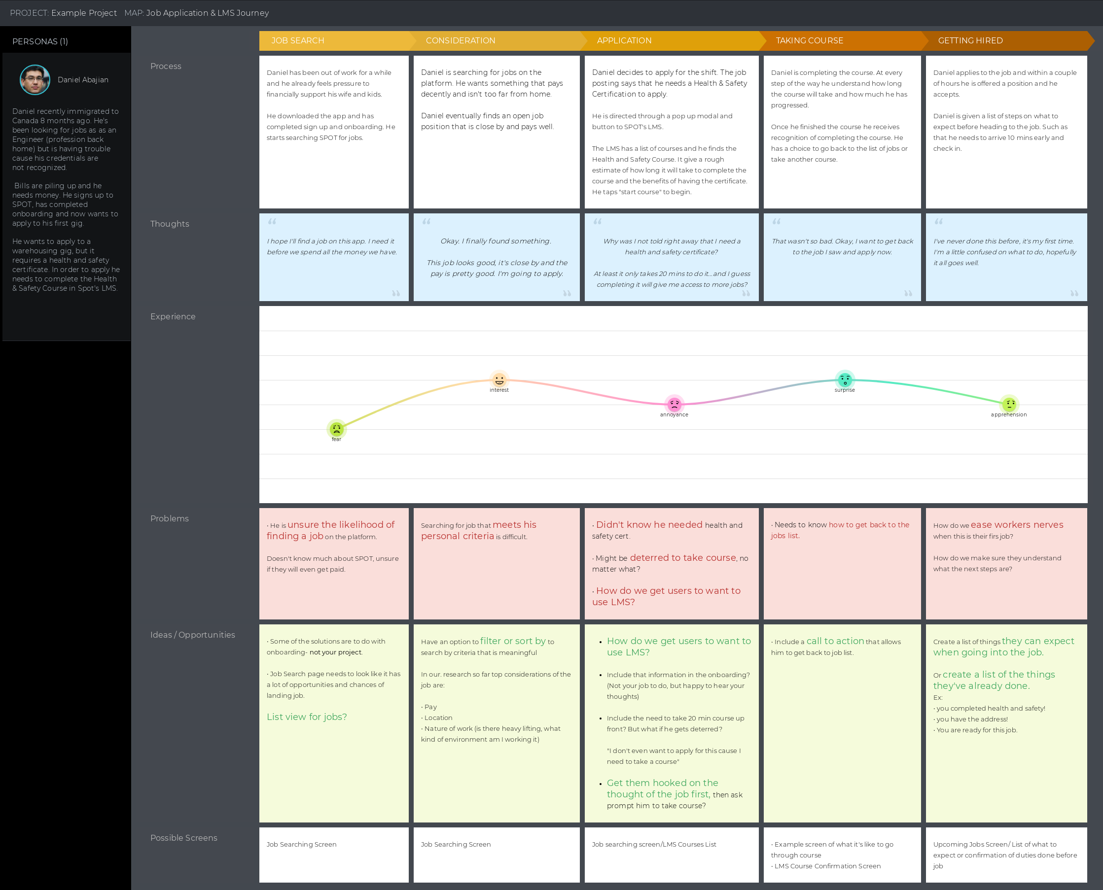
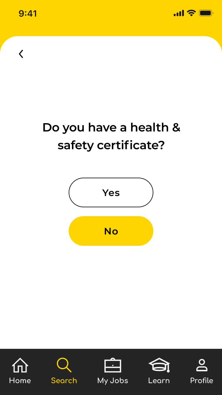
The SPOT App team provided us with a journey map that follows a user, Daniel Abajian, a recent immigrant to Canada who has been looking for jobs as an Engineer. He hasn't had luck and with bills piling up; he signs up for SPOT and applies to a warehouse position. Unfortunately, he has to take a Health & Safety course in the SPOT App LMS in order to apply.
We used the journey map to look at the progression of a SPOT App user in how they find an opportunity, completed the LMS course required for job, and finally applied to the job, as we designed our sketches and wireframes.
Design
Sketches
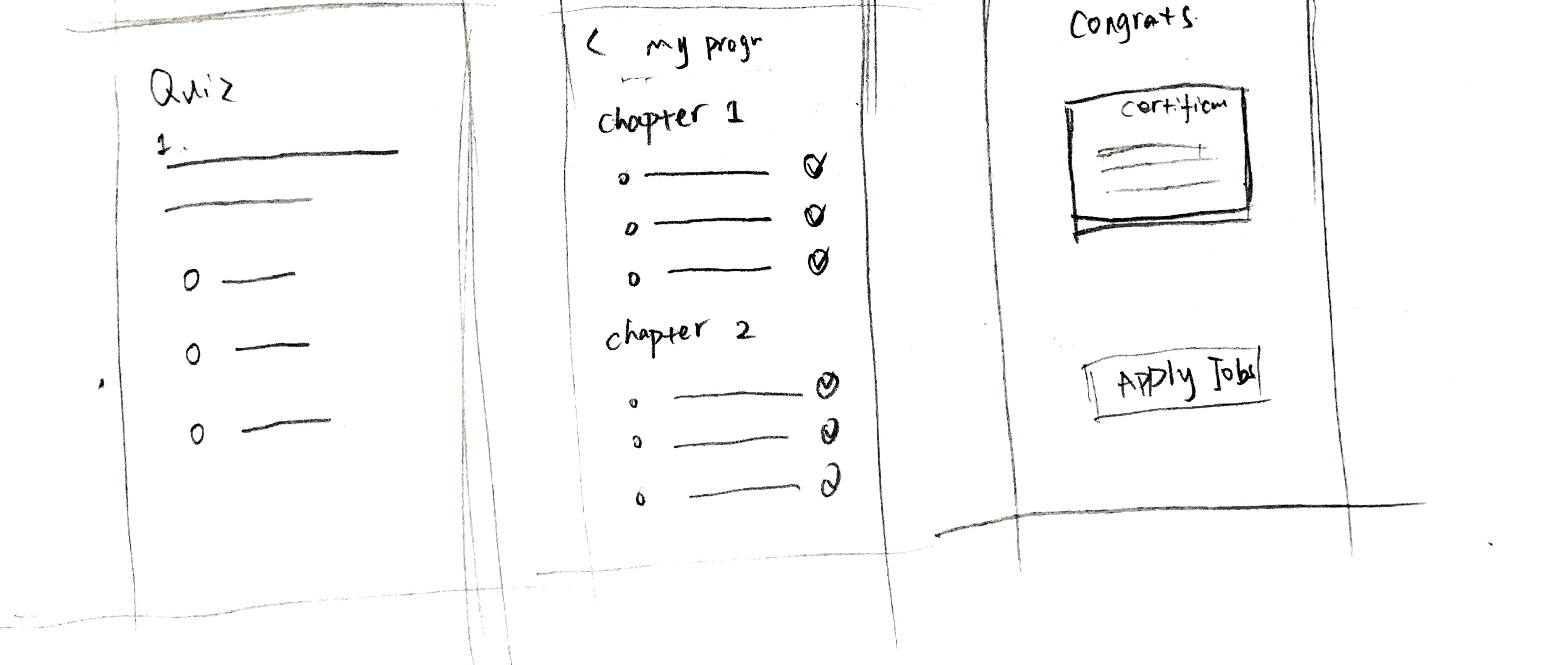
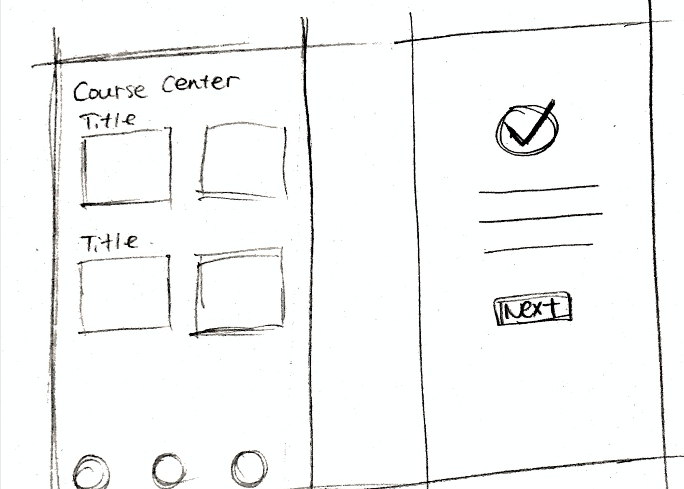
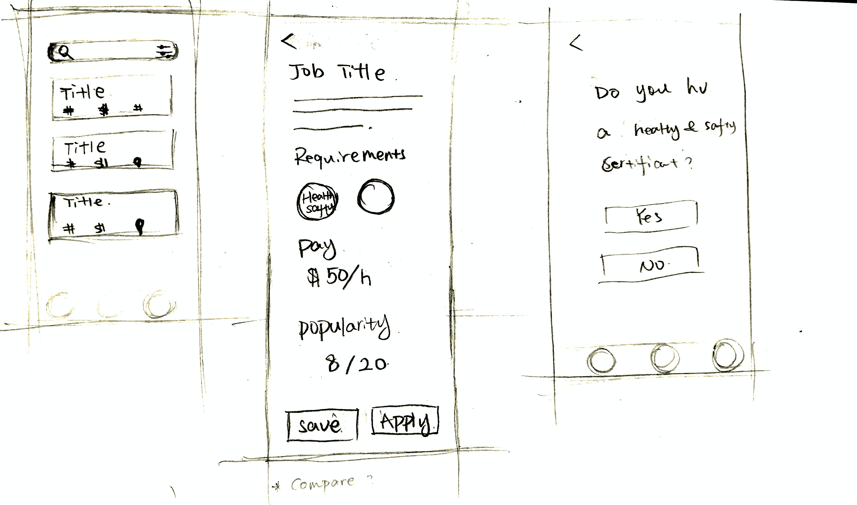
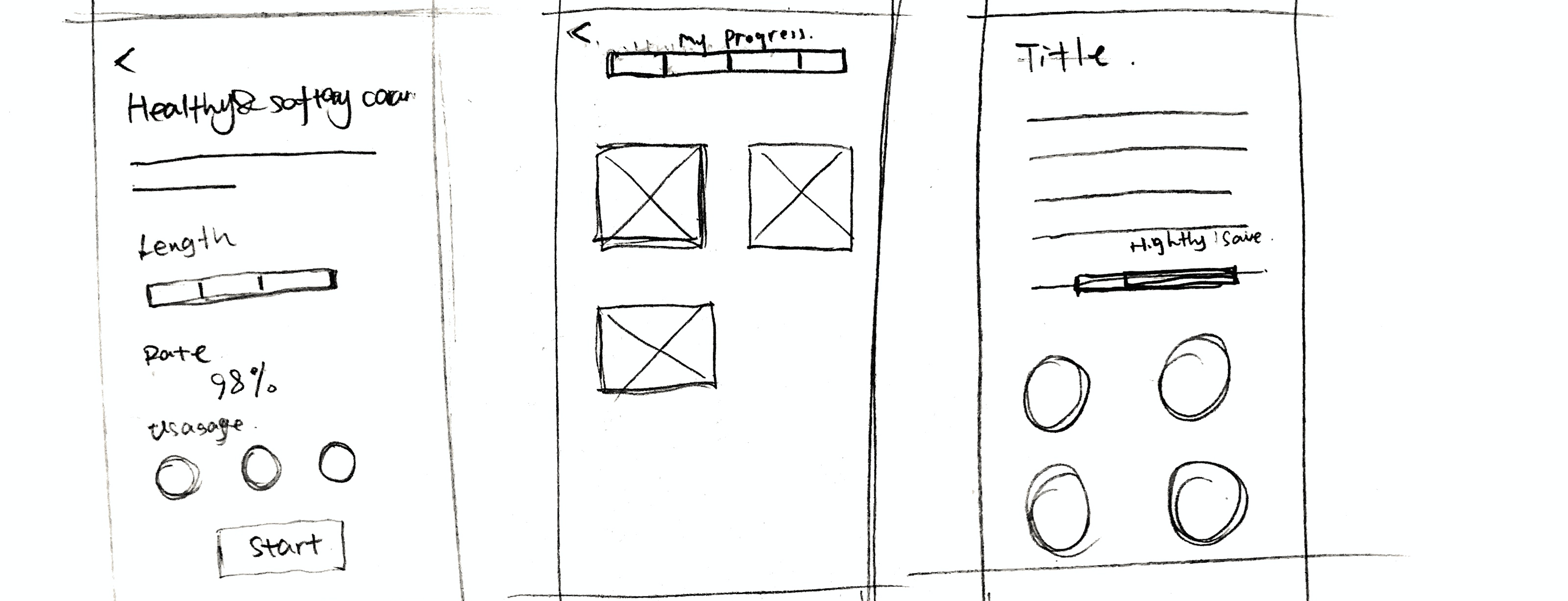
The SPOT App team asked us to address the following tasks when designing:
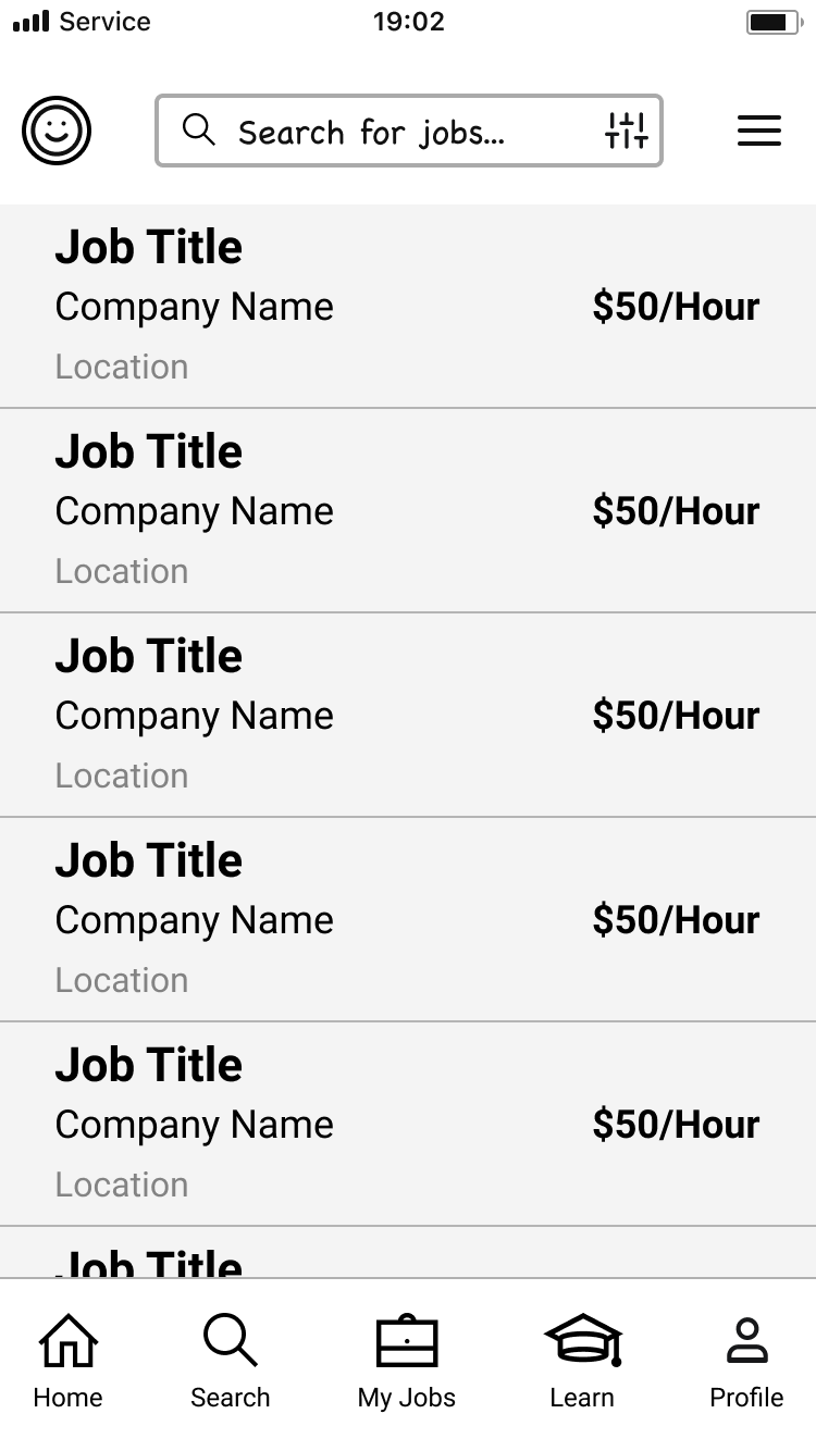
- Searching for a job
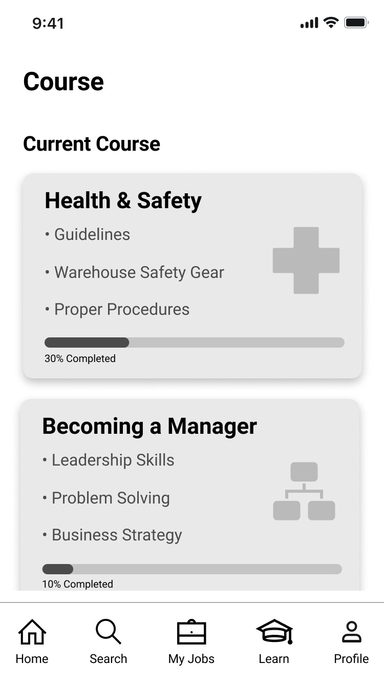
- LMS Course List
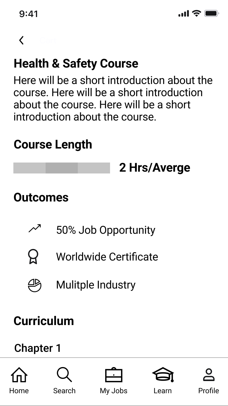
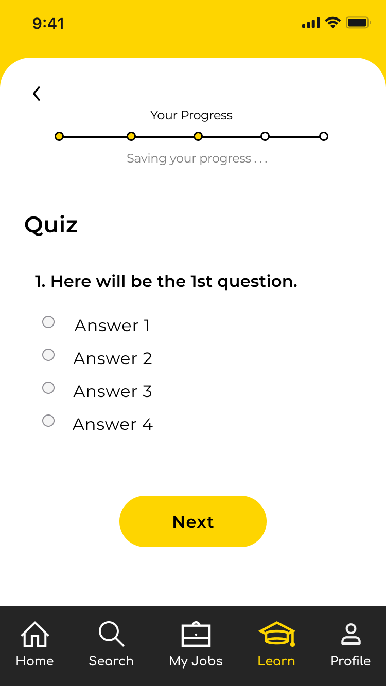
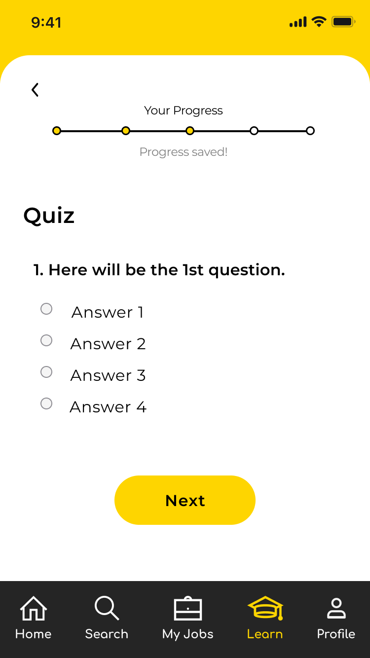
- An example of what it looks like while taking the course for a job
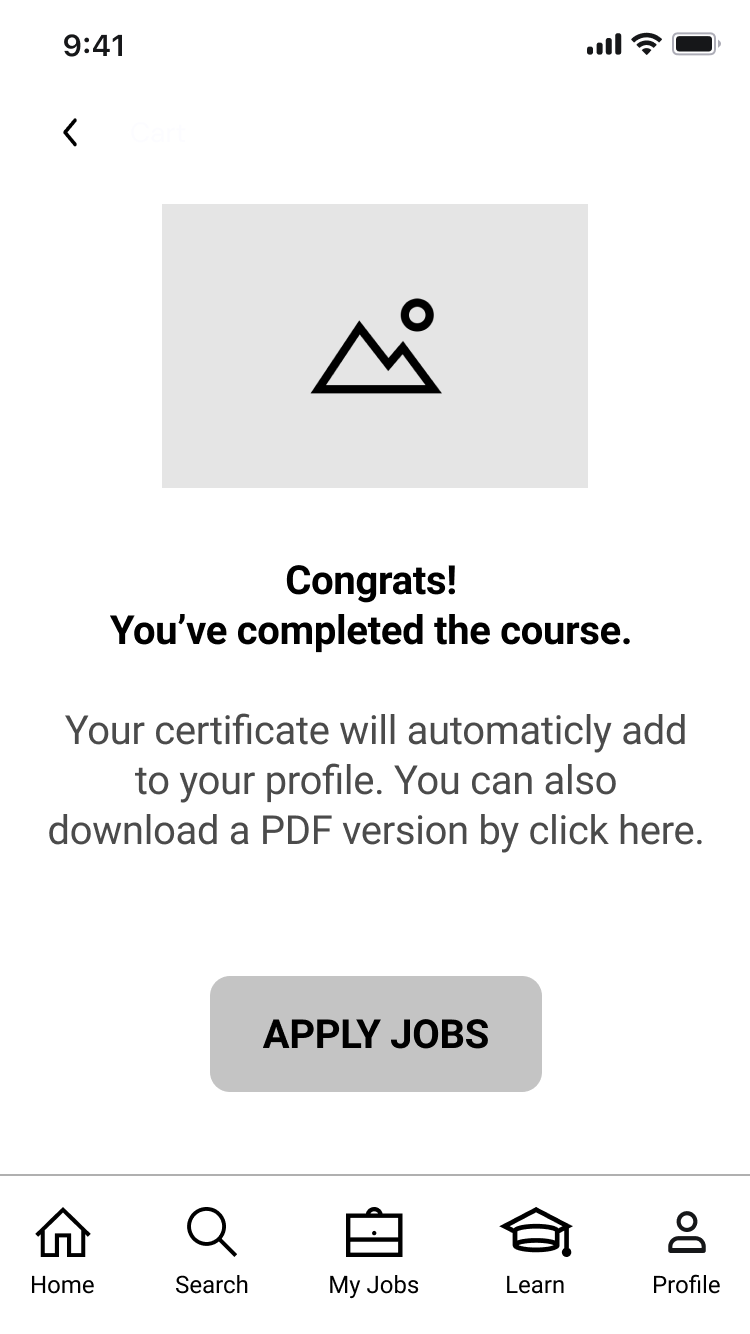
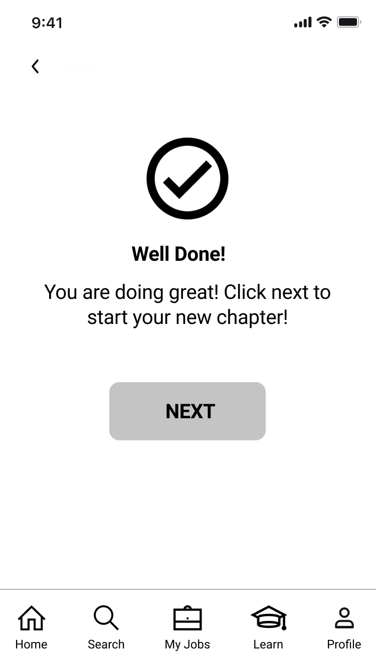
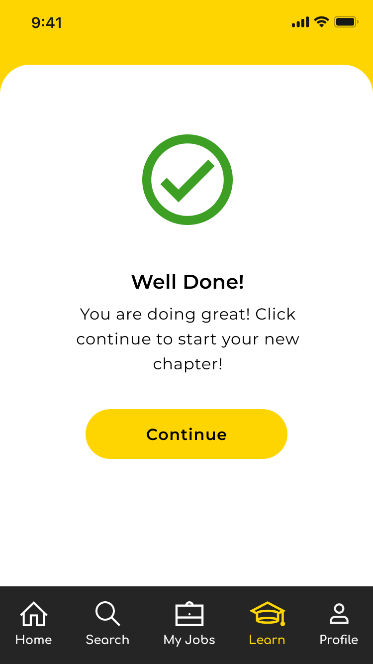
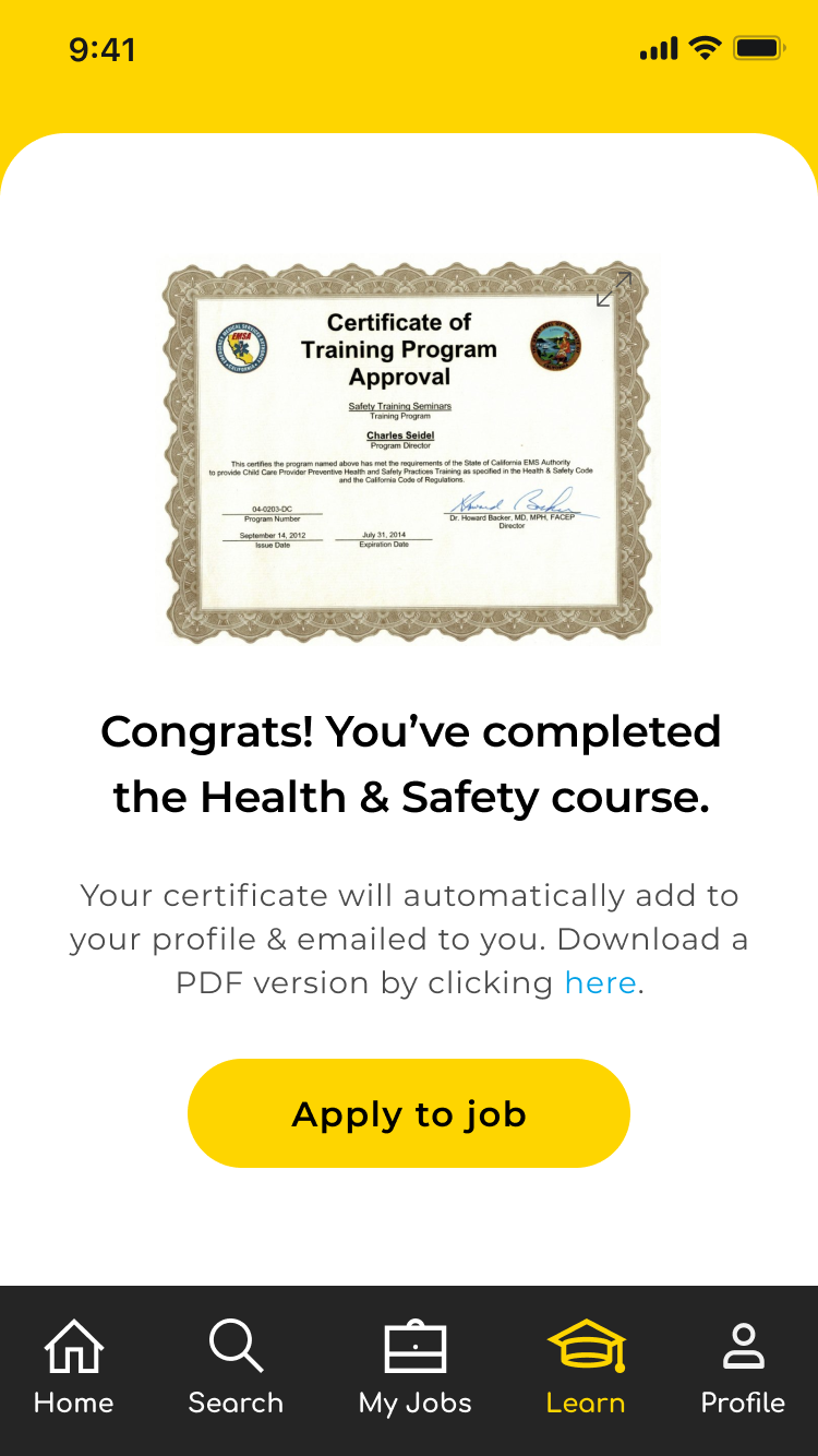
- Course confirmation once the course is completed
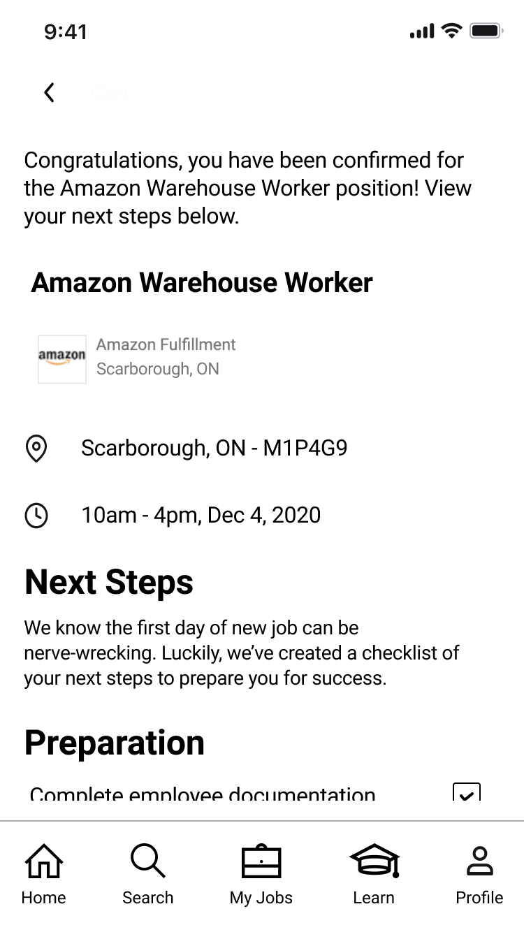
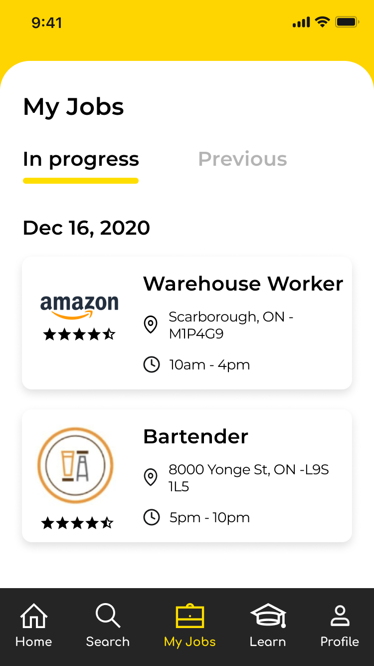
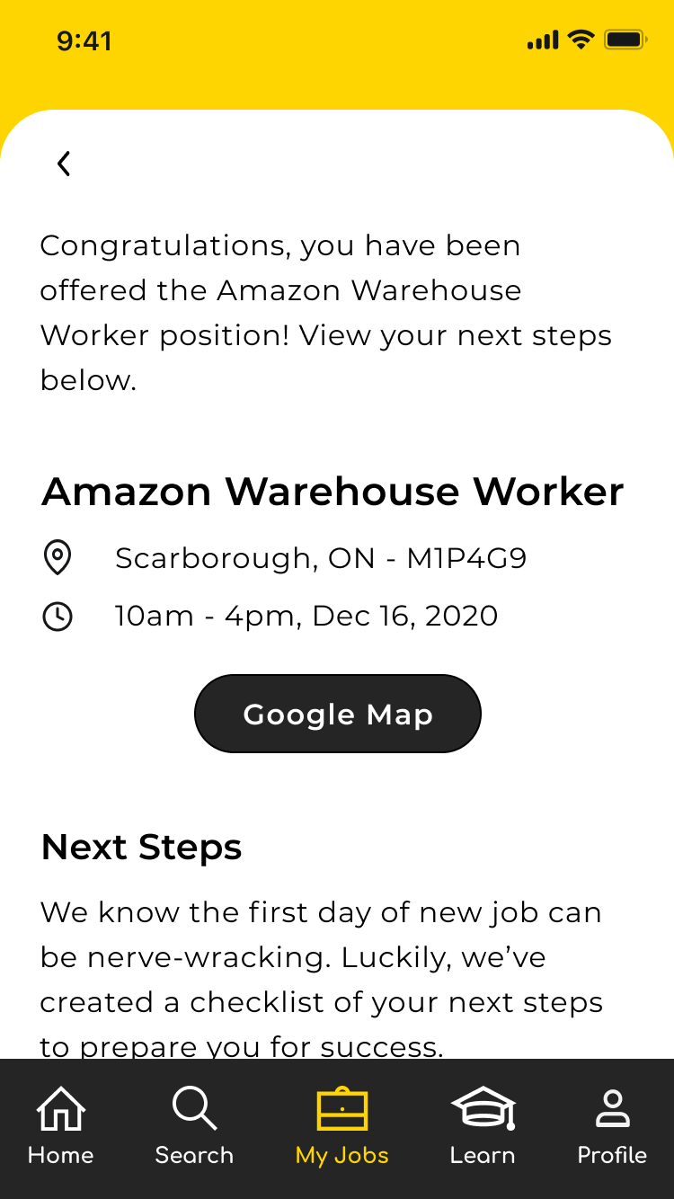
- Confirmed Jobs/Hired and a possible checklist of next steps
We sketched out the initial screens above and included a couple of draft wireframes to get a further idea of the direction we wanted to go with the design.
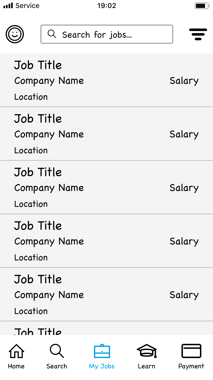
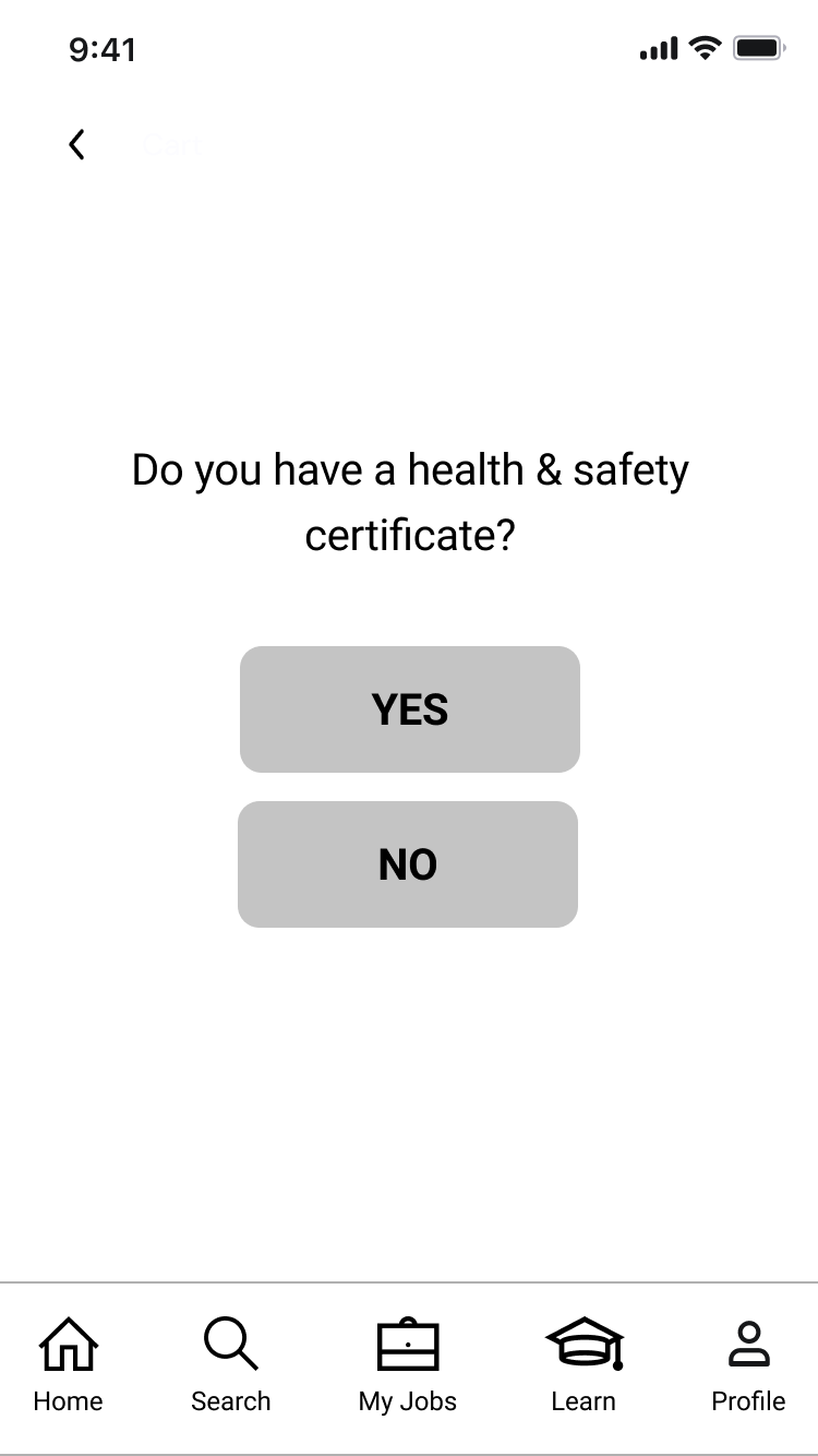
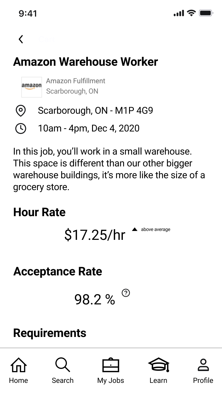
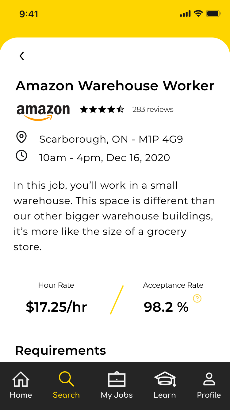
Using the journey map and research, we included sketches of the LMS dashboard of courses, a flow of screens showing browsing for a job, the job description, and asking a user if they’ve taken a course for the job they are applying for.
Wireframes
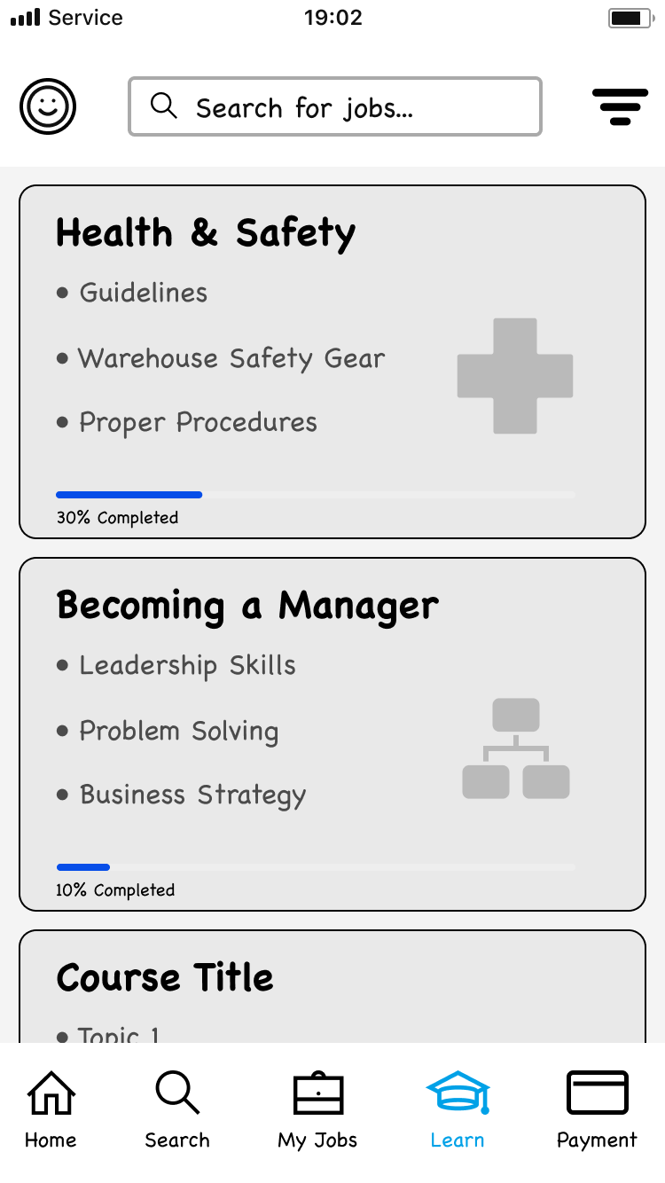
As we developed our wireframes, we re-evaluated our sketches and referenced our competitive analysis to ensure we were designing the best experience for the user. For example, instead of including a payment option in the menu bar, we felt it would be better to keep that within the user profile tab along with other user-related settings.
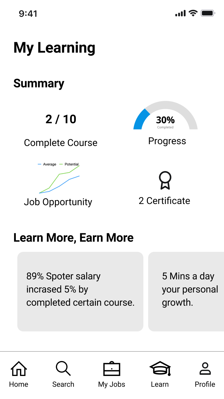
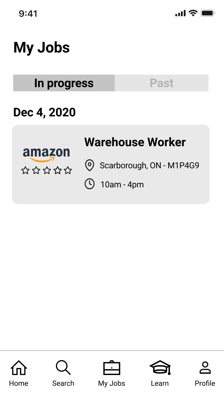
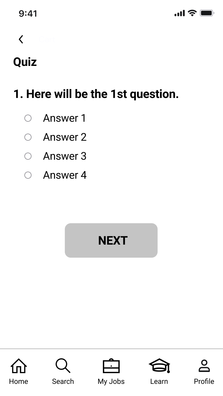
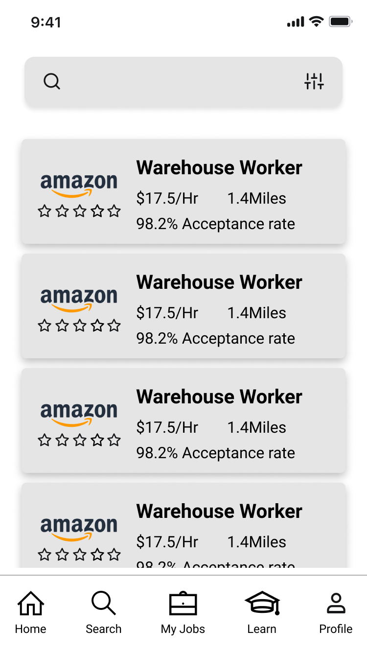
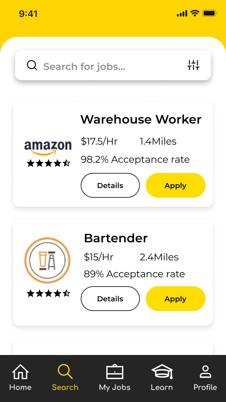
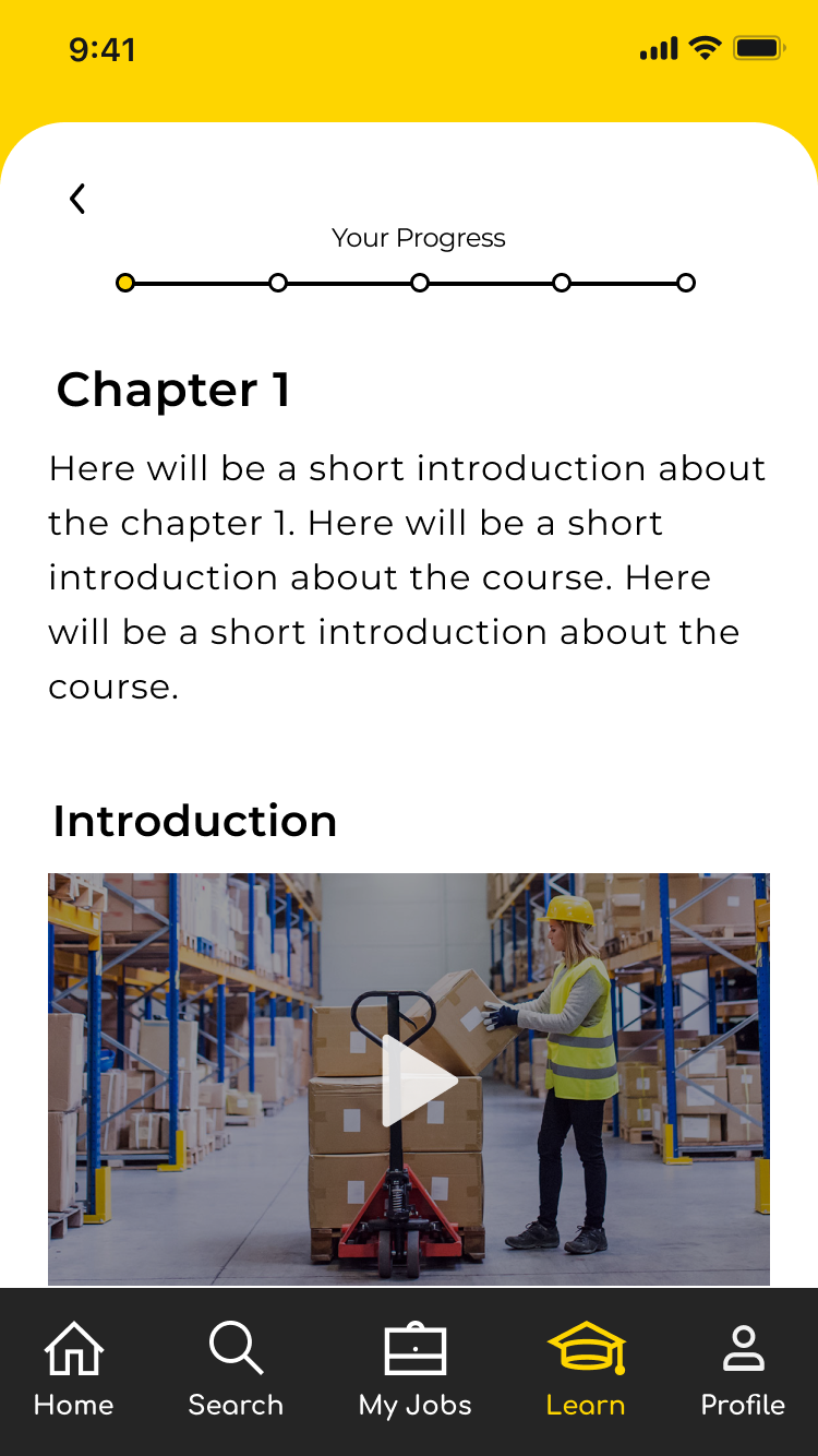
We continued designing our wireframes and reiterating on the LMS elements such as searching for a course, taking a course, and including a learning dashboard for users to see their overall performance. We drew inspiration from the competitive analysis like the browsing layout of Freelancer. Incorporating a card structure as a user searches for courses and jobs helped users navigate easily and digest information efficiently.
Since the SPOT App team stressed the importance of gig workers and employers needing to feel more prepared for a job, we included a checklist of tasks users complete up to the day they arrive. This included bringing documentation such as IDs and forms, watching training videos, arriving on time with the address in hand, tracking hours worked, and pay.
Style Guide
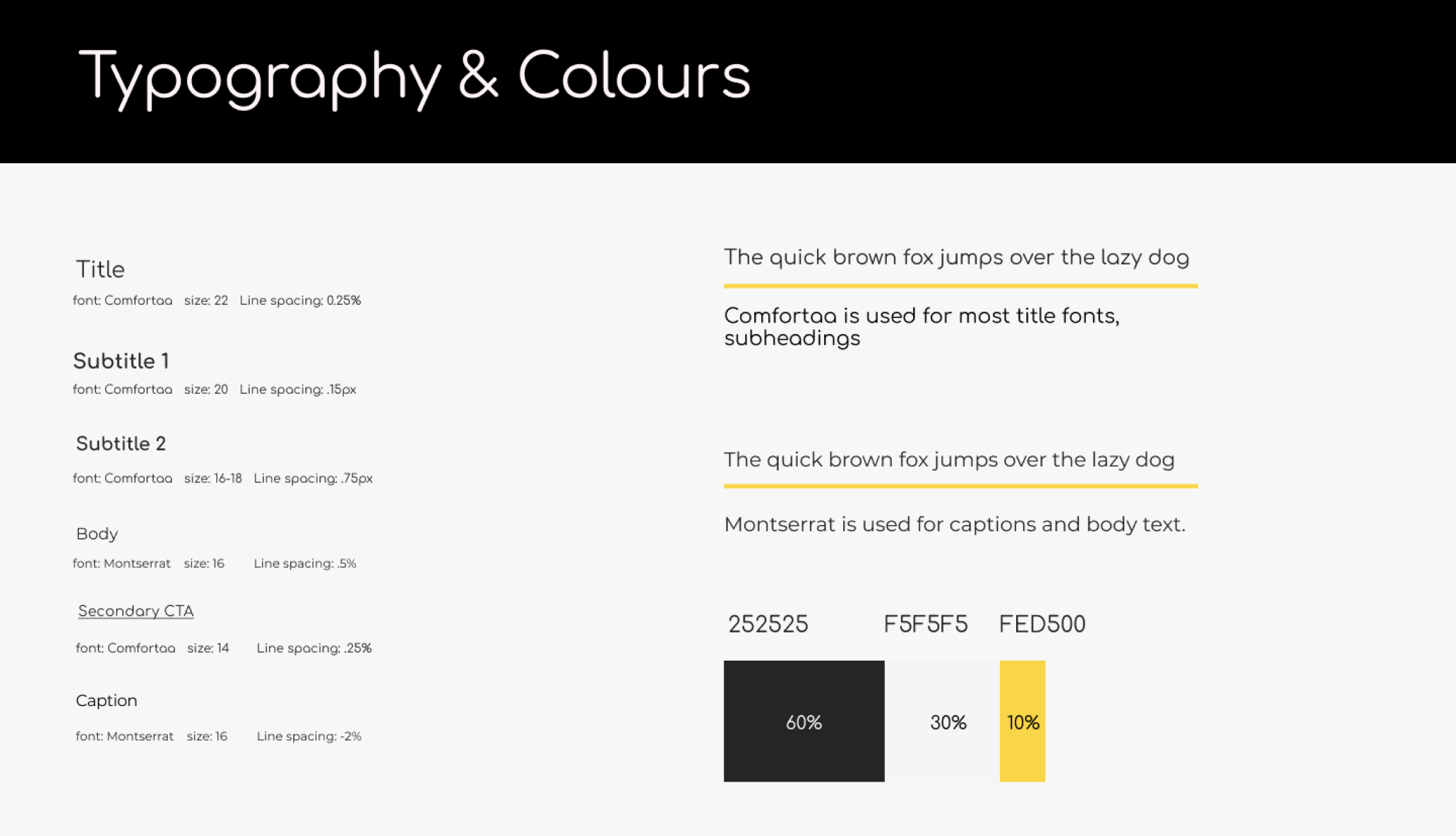
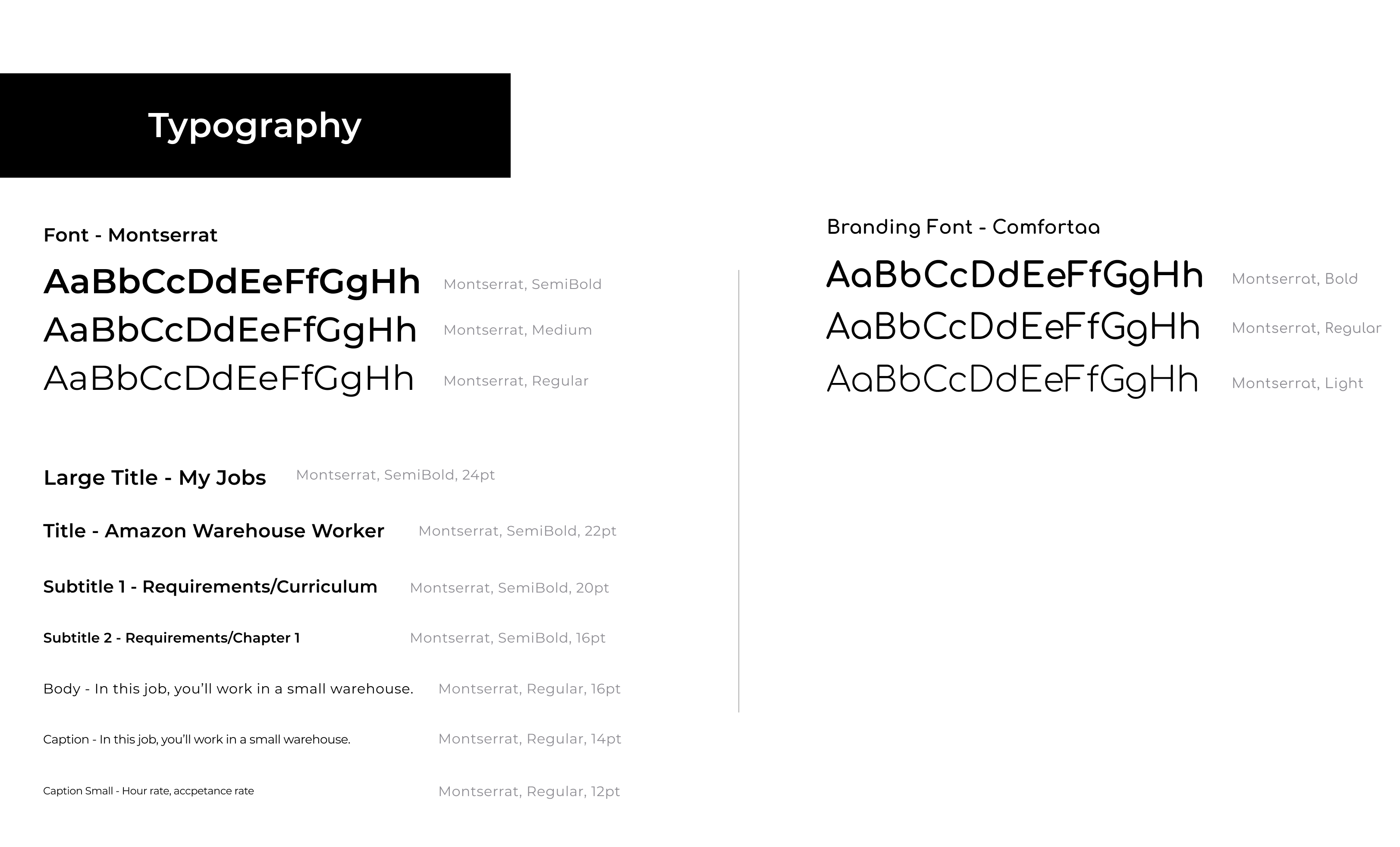
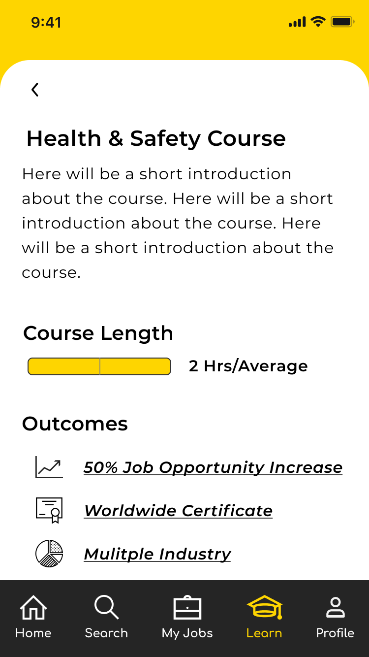
SPOT App provided the style guide for us to use when designing our high fidelity mock ups. They used two fonts, Montserrat for body text and captions and Comfortaa for headings and subheadings.
The colors they used were an off-black (#252525) as their primary brand color, off-white (#F5F5F5) as their secondary color, and their SPOT App yellow (#FED500) as accent colors.
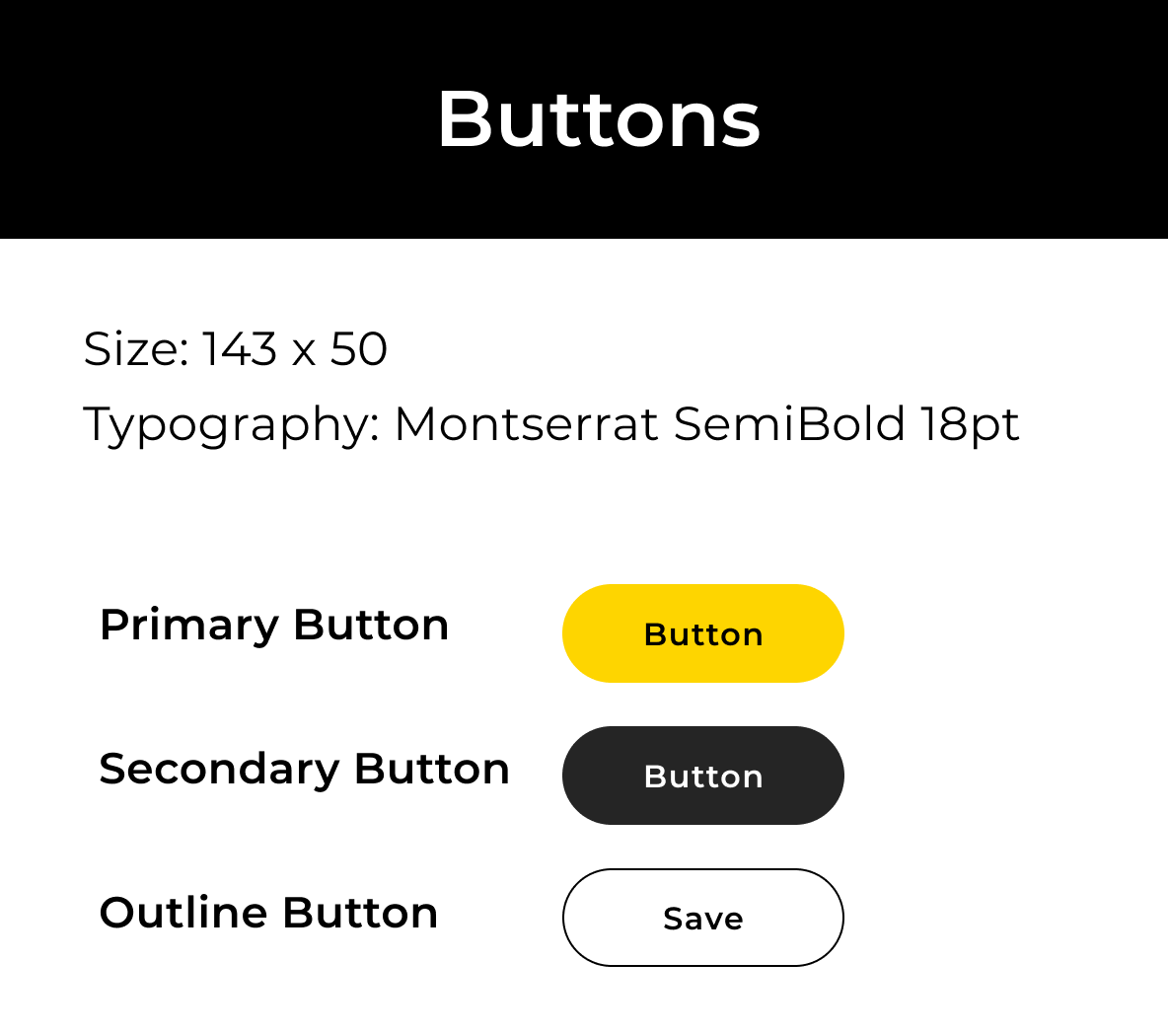
For their buttons, they use Montserrat and use their SPOT App yellow as the background for the primary button.
Prototype
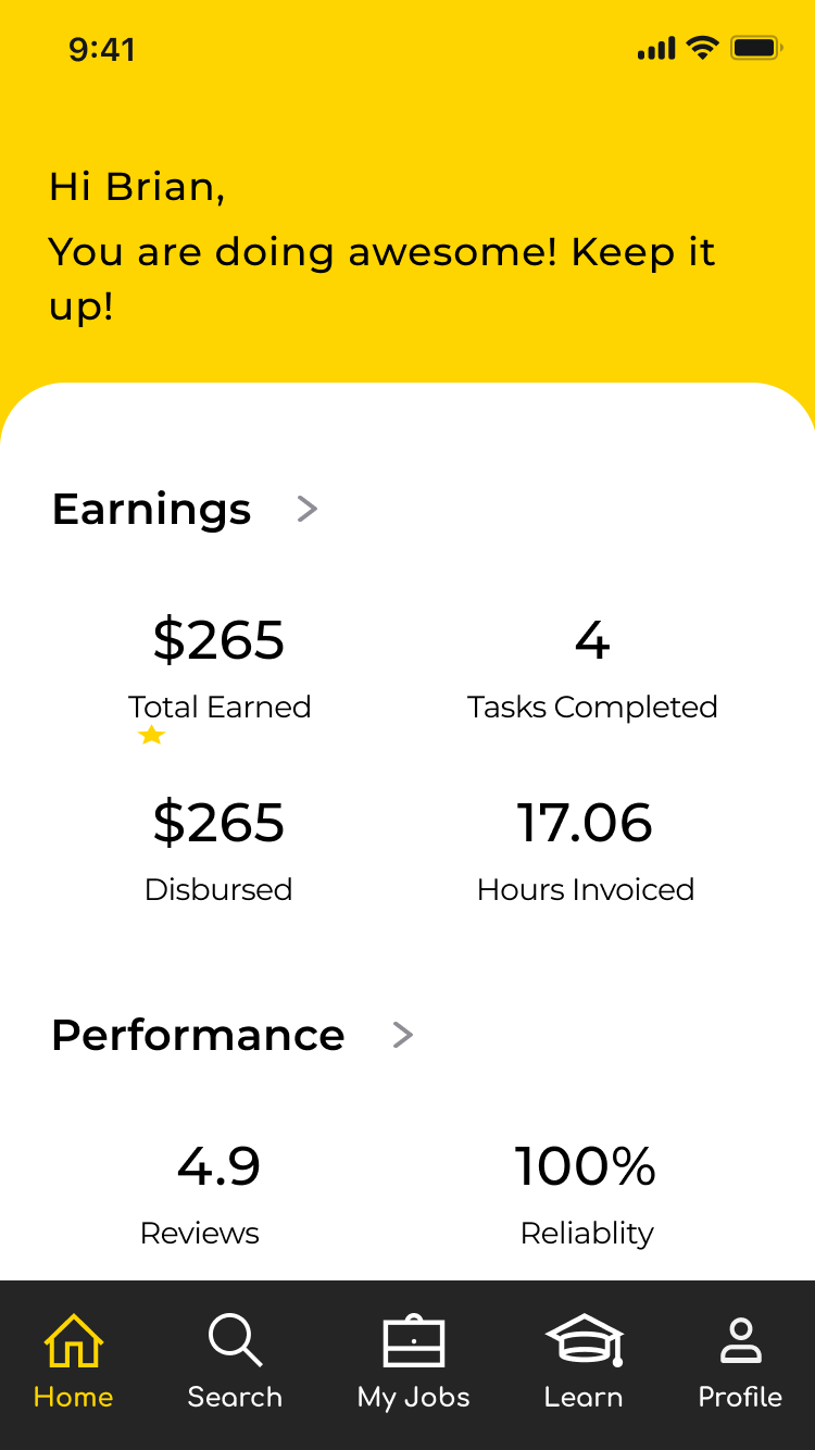
Using the SPOT App style guide along with our recommended changes, we created high-fidelity screens of the LMS experience and searching for a job experience. The initial SPOT App design did not have some functionalities such as a menu bar, that we felt would be useful additions to the app. Having suggested that to the SPOT Lead Designer, they felt it was the right approach.
Prototype Screens
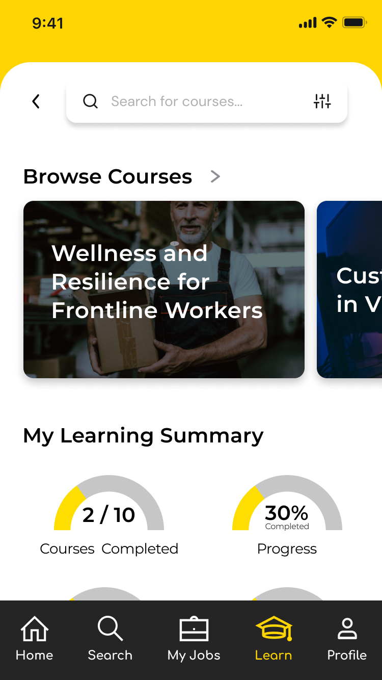
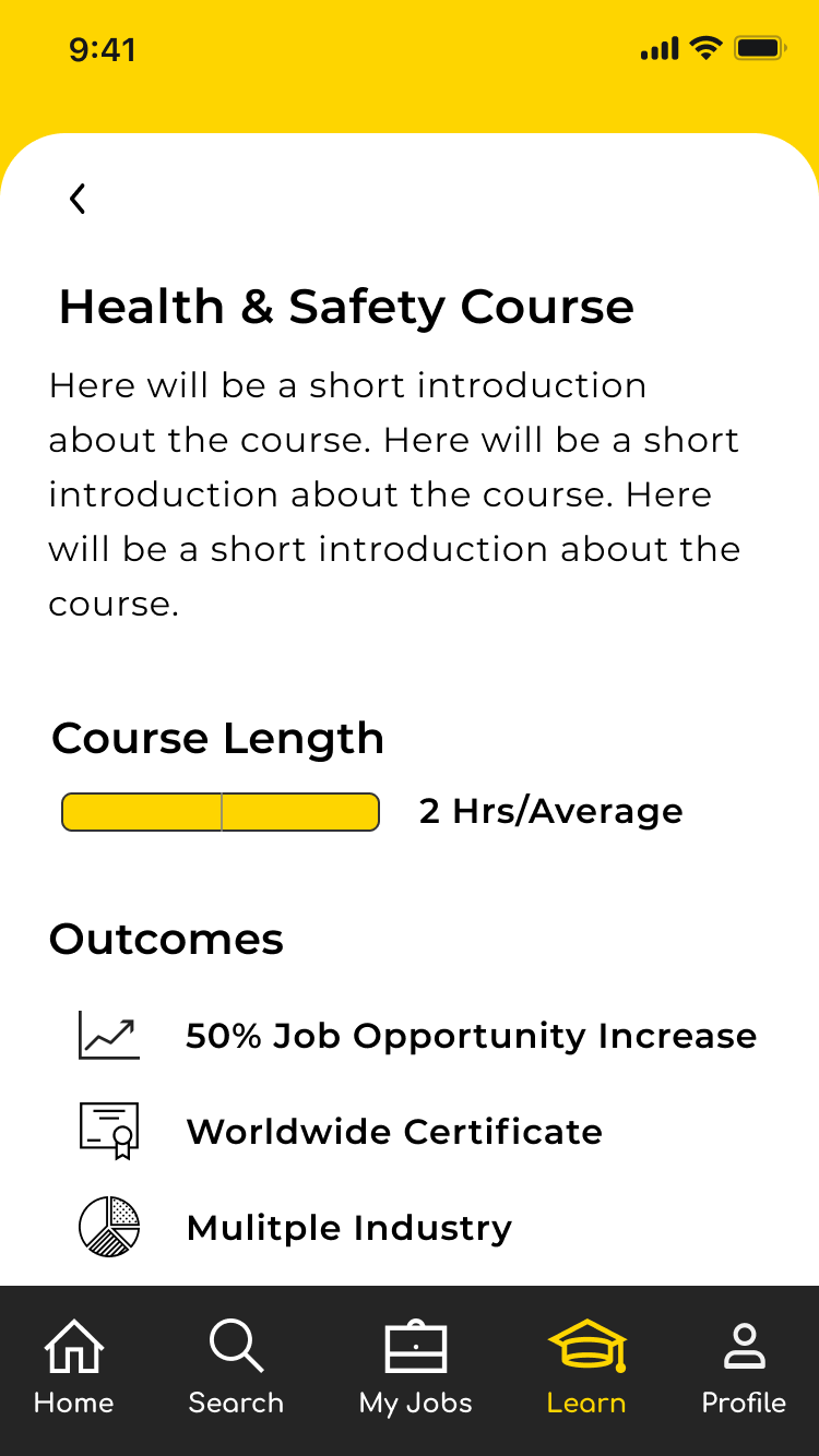
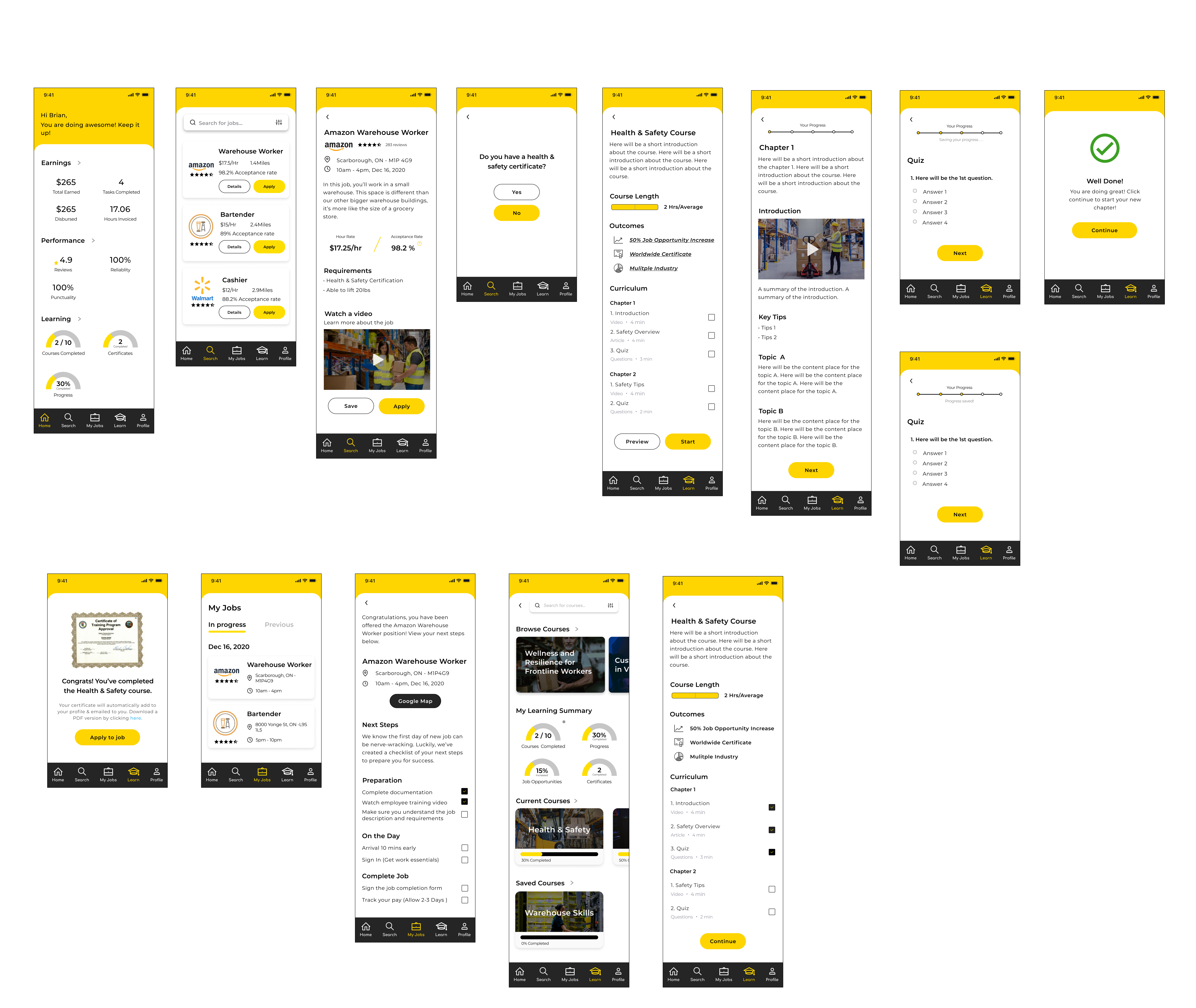
Evaluation
Usability Testing
We conducted 4 moderate usability tests and 1 unmoderated usability test with 5 participants from a personal network.
Objective
To help understand the kinds of problems users might run into when interacting with our product, as well as how satisfied users will be with the product.
Participants
- Emily P., 30yrs old, Female, Freelance Designer
- Brian H., 36yrs old, Male, Unemployed
- Andrew, 35yrs old, Male, Sales
- Tess L., 30 yrs old, Female, TV Writer
- Maxx K., 32 yrs old, Male, Retail Worker
Test Questions/Tasks
Some key questions we asked during the usability test to uncover potential usability problems were:
- What is your initial impression?
- What does the label mean to you?
- Can you find the information you want?
- Are there any other things you would expect?
Scenarios
- You just downloaded the SPOT app and want to find a job quickly. Go into the app and find a job you’re interested in and learn more about it.
- You see some of the job requirements and realize you don’t have the necessary courses completed. Complete a course so that you can apply for the job.
- Since you need some additional requirements before applying to the job, save that job for later so you can access it without searching for it.
- Complete the course requirement and come back to the job application page and apply to the job.
- You’ve applied to the job but you want more access to other jobs so you can get a higher pay grade along with more opportunities. Browse some courses to complete while you wait for a response to your previous application.
- You were just accepted to the position that you applied for. View your checklist to prepare for the new job.
Results
We recorded our findings from the usability testing and categorized them based on the impact and priority to the user:
- CRITICAL: Multiple users could not complete a task. These issues are issues you must fix before you launch your app or site.
- MAJOR: Multiple users struggled to complete a task. These issues are important to fix before you launch your app or site.
- MINOR: Users completed a task but raised concerns about design choices. You should fix these issues when time allows.
- NORMAL: Users identified a cosmetic problem. You should fix these issues when time allows.
| Priority | Issue | Focus Area | Description | Recommendation |
|---|---|---|---|---|
| Major | Issue | Cert Confirmation / Apply to job | User is taken to job search page instead of apply to specific job page from cert confirmation page | User should be taken to the specific job application page when clicking apply on cert confirmation page |
| Minor | Issue | Required courses for job | User didn’t quite know where to look in order to take a required course. | Include a link to required courses in job specific page and also break out certifications and actual job skills for a cleaner presentation |
| Minor | Quote | Courses page/My learning summary | Is a certificate different than a course? Courses completed vs certificates?? | Include a info icon next to each learning section that users can hover over to learn more about the particular section. Ie; “Courses Completed” |
| Minor | Efforts | Home |
|
|
| Minor | Comprehension | Multiple areas | Users asked the meaning of Disbursed, gig jobs, acceptance rate vs hiring rate? | Choose user friendly words to help the user understand the meaning. For example, Hiring rate is more user friendly compared to acceptance rate. |
| Minor | Quote | Curriculum | “I wish there is more information about the multiple industry” | Create a clickable popup page to learn more about the outcomes. |
| Normal | Ideas | My jobs/Job preparation | Love the map, but also adding a calendar would be great here. | Syncing with the user's calendar will be very helpful. 1) easy to manage schedules; 2) Job recommendation based on the available time slots; |
| Normal | Issue | Courses checklist | User clicked on check marks when prompted to complete course | Use a percentage-based circle that shows the user how much of the course they have completed |
| Normal | Ideas | Search for Job/filter | I would expect the filter function based on distance, company, hour rate, job categories | Consider add distance, company, hour rate, job categories under the filter |
Next Steps
After sending our usability test results to the SPOT App team, they were beyond pleased with our assessment and recommendations. The SPOT team said they will move forward with a good portion of our designs in their next and subsequent builds of the app.
They specifically said the layout of the app is something they’re focusing on in the immediate build and that our menu bar layout was exactly what they were looking for in a design.
Take-Aways
Working with SPOT App and their team, along with my colleague, was an amazing experience. The SPOT team was flexible in working with suggestions we had and they were communicative about their goals throughout the entire design process.
Designing an LMS for a job app was very rewarding, especially during a pandemic, when people direly need employment.
I enjoyed working with my colleague as well. We both communicated our ideas thoughtfully and could compromise easily on thinking that contrasted with each other.
